LA Opera Packages Case Study
Role: Interaction & UX Design
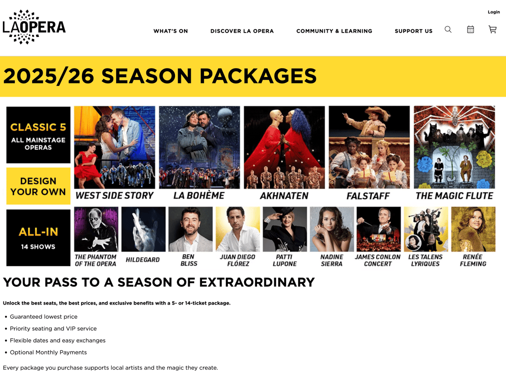
Problem: The season lineup image drew the most clicks on the page, but it was non-interactive, causing user frustration, U-turns, and lost conversion opportunities. Users expected to explore shows or buy tickets directly, but the static design blocked their intent.
Solution: We redesigned the lineup into clickable, trackable tiles with hover states, giving users direct access to details and ticketing while capturing valuable engagement data to improve conversions.
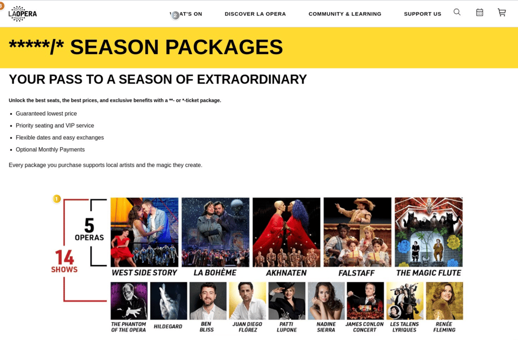
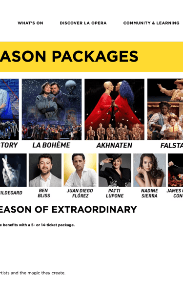
Snapshot of old graphic on site
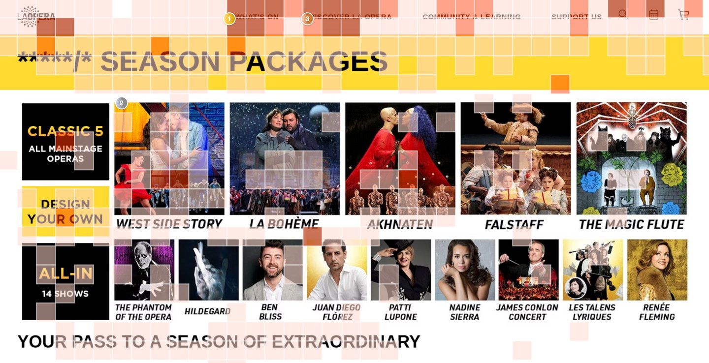
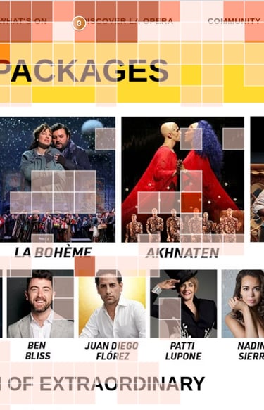
Old Heatmap - 35% of page clicks
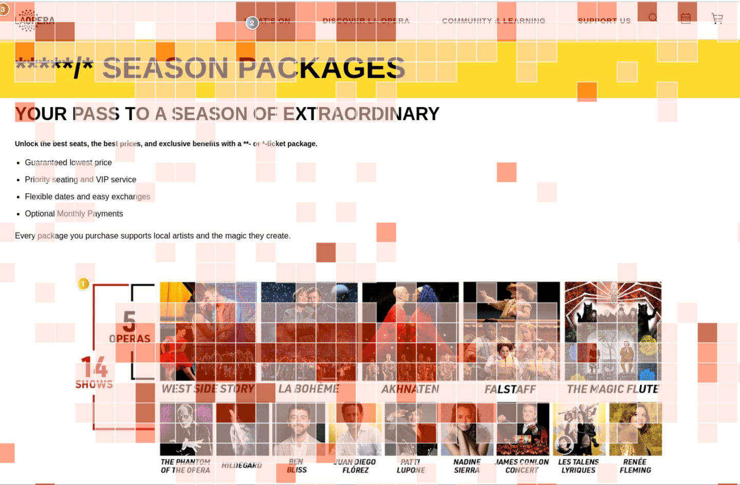
The heatmap shows that the season lineup block is the most engaged area on the page, drawing the highest concentration of clicks across all productions and artist images. Users consistently interacted with show tiles such as West Side Story, La Bohème, and The Magic Flute, expecting each image to link to more details or ticket options.
Redesign
The new design replaces the static block with a clear, interactive grid featuring clickable tiles for each opera, concert, and artist. Bold package options (“Classic 5,” “Design Your Own,” and “All-In”) guide users into the right purchase path, while the modern layout improves clarity, usability, and conversions.
New design metrics
The redesign reduced the dominance of one “false hotspot” and redistributed engagement across operas, artists, and package CTAs. Even with fewer total clicks on the block, the design converted more users into buyers, proving that better pathways matter more than click density.
Overview
Total clicks dropped (1.2k → 779), but rage clicks = 0 and U-turns nearly halved (32 → 18).
Errors decreased (42 → 37), showing reduced friction.
Avg. time on page increased (1:10 → 1:14), reflecting deeper engagement.
Most importantly, the redesign met and exceeded package sales goals, proving that better UX funnels mattered more than raw click volume.
The original season lineup image was visually engaging but non-interactive, resulting in wasted clicks and user frustration. By analyzing heatmaps and session data, we identified that users expected show tiles to be clickable entry points into details or ticketing. The redesign introduced a clear, interactive grid with package CTAs, clickable show tiles, and improved tracking. Tested over comparable two-week periods, the new design reduced friction, improved user flow, and directly contributed to exceeding sales goals for season packages.
Old grid vs New grid
User intent matters more than clicks — high engagement is meaningless if the interaction path doesn’t align with user expectations.
Quality over quantity — total clicks decreased, but conversions increased because engagement was funneled into the right places.
Clarity drives confidence — dedicated package CTAs and interactive tiles reduced confusion, U-turns, and page errors.
Iterative testing is critical — comparing equal two-week windows showed that UX design changes, not external factors, were responsible for improved results.
Conversion is the real success metric — by shifting from wasted curiosity clicks to actionable CTAs, the page became a true driver of revenue.