LA Opera Packages Page
Role: Interaction & UX Design
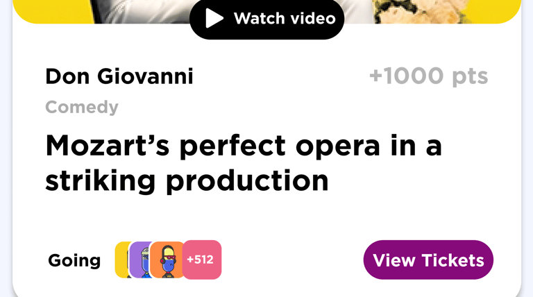
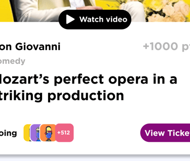
Problem: The season lineup image drew the most clicks on the page, but it was non-interactive, causing user frustration, U-turns, and lost conversion opportunities. Users expected to explore shows or buy tickets directly, but the static design blocked their intent.
Solution: We redesigned the lineup into clickable, trackable tiles with hover states, giving users direct access to details and ticketing while capturing valuable engagement data to improve conversions.
Prototype
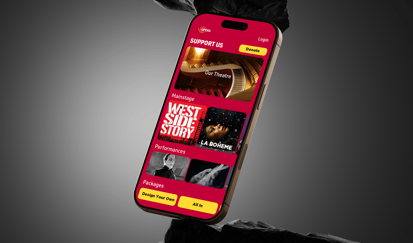
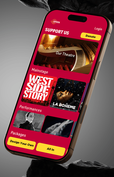
The initial brief was very ambitious. Even though I created a mockup in Figma to show the design. I made suggestions that would be easier for a new user landing on a page after a general LA Opera advert.
Close up of features
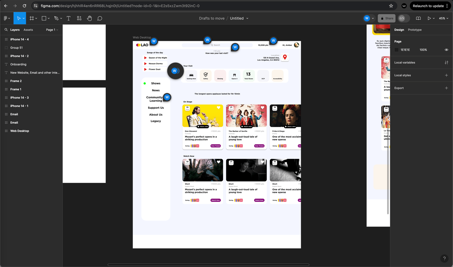
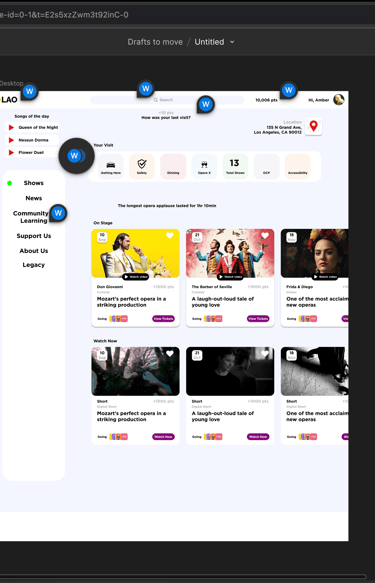
Redesign
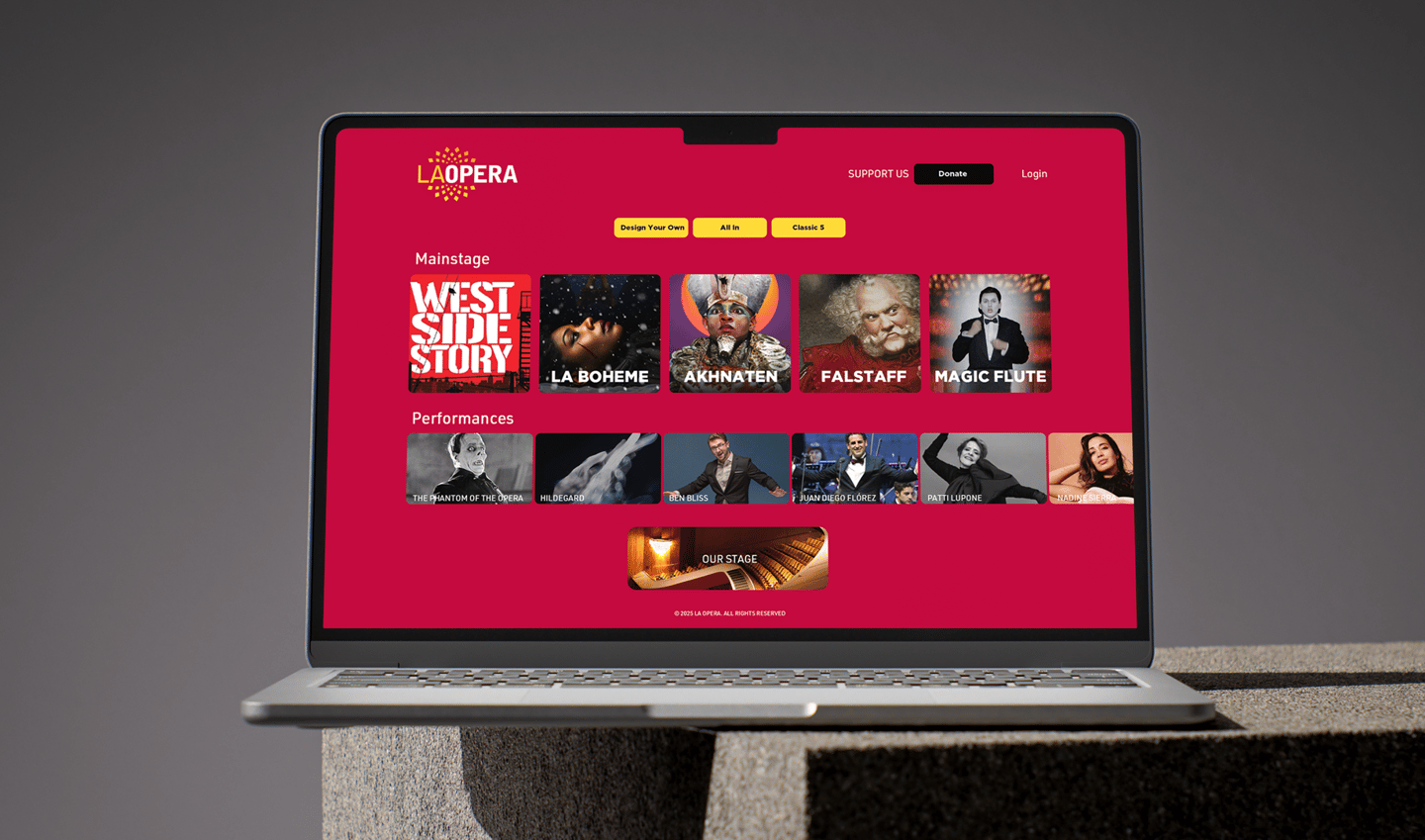
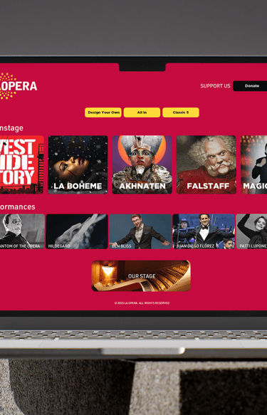
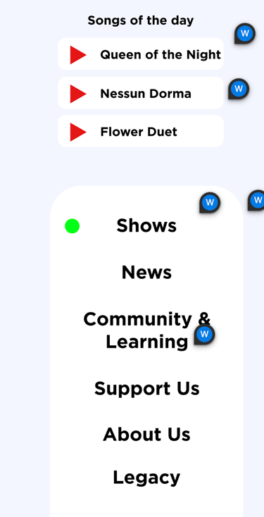
My pitch. After studying their audience and tracking user activity on the main site for a few weeks. I quickly noticed a few things. They were interested in most of the modules and widgets on the site. They just wanted to learn about the shows and performances. There was a graphic that was created by their graphic designer to give a snapshot of the season.
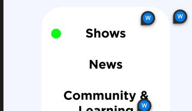
Redesign